Wednesday, October 31, 2012

How to create a CHILLING PORTRAIT manpulation for Halloween


Step 1- Choose the Model.

This Picture is great to create this type of manipulation, because the model’s make up help a lot

Step 2 – Change the size.

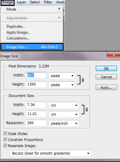
To do this go to Image -> Image size. Or Press (Alt+Ctrl +I). Resize the image to: Width:837 X Height: 1300 pixels and press ok.
clip_image006

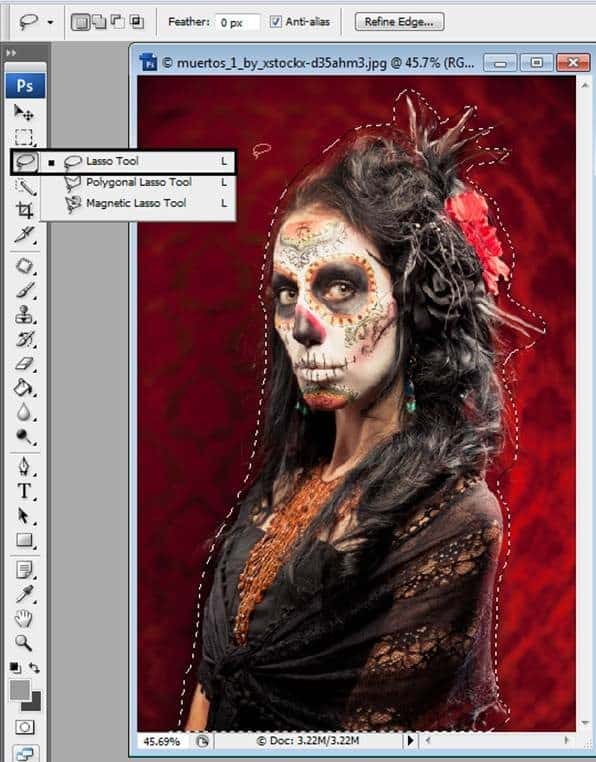
Step 3- Select the Model.

Use the Lasso tool to Select the model.
clip_image008

Step 4- Duplicate a Layer

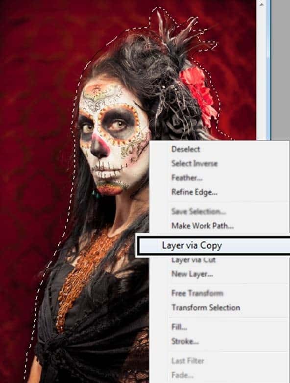
To duplicate that selection press Ctrl + J. Also you can give a right click in the selection and press the option Layer via copy.
clip_image010
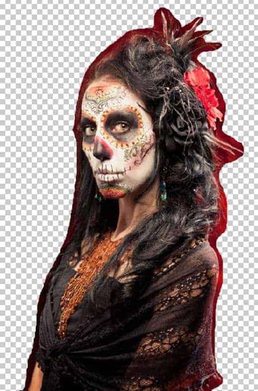
You are going to have something like this:
clip_image012

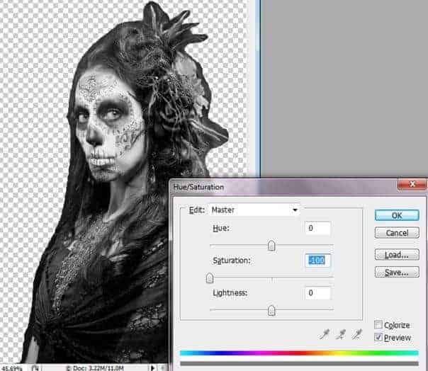
Step 5 – Less Saturation

Duplicate the layer once again (Ctrl + J). In this layer reduce the Saturation (Ctrl + U) option Saturation: -100.
clip_image014

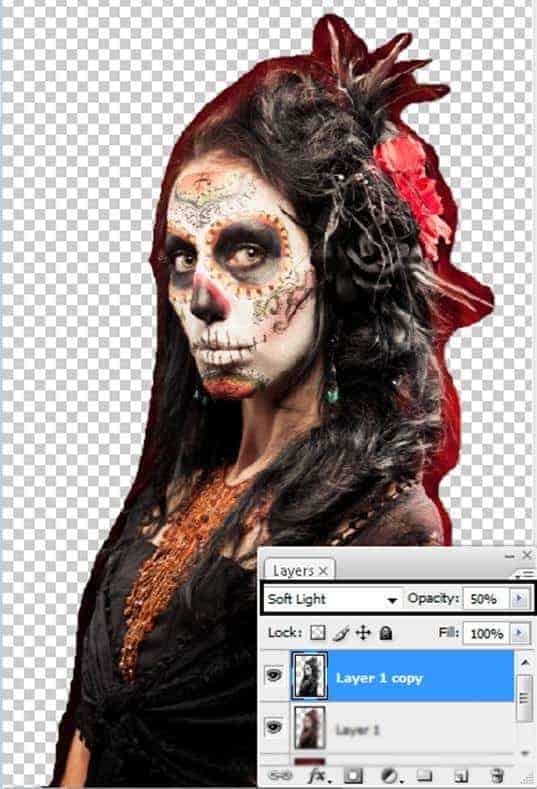
Step 6- Set the layer blend mode in Soft light.

To get more contrast use the layer in soft light mode with and reduce the opacity by: -50.
clip_image016

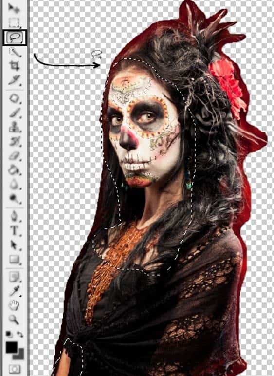
Step 7- The Skin

Use the Lasso tool to select the model’s skin and duplicate the layer (Ctrl +J).
clip_image018

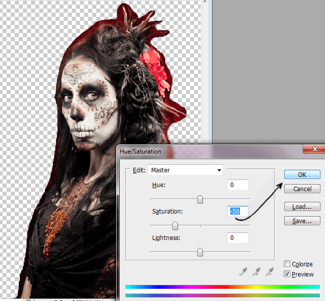
Step 8- Reduce the Saturation

Press Ctrl + U. Or go to Image -> Adjustments -> Hue/ Saturation. In the option Saturation reduce at -50.
clip_image019


How to build a "(Glass Button) Photoshop?


Here you will learn how to make such a button by photoshopit. If you follow the steps of learning will also get you this result, so do it carefully.

Select Rounded Rectnagle tool, Radius do 3 pixels. Background color (background) choose you own, and create a shape like below.

On the keyboard, press Ctrl + J to duplicate layer.Hide the first layer. Choose the  eraser tool, and do 27 px.

Delete as part of the picture

Now the main layer let the Unhide. Hold Ctrl + Click on the layer with the mouse. Go to Select> Modify> Contract and make 1 px. Then do you inverte control + i.

Reassure hide the original layer again. If you can not delete, will not use. Now create a gardient like this.

Creat another layer. Select the Gradient Tool. Select Linear Gradient and fill the selection below


Now delete the left and right as in the picture

Merge all the layer and add drop shadow as in the picture

And as the last step add text as desired button


Working with color harmonies in CorelDRAW Graphics Suite X6


Color styles can be combined into groups called harmonies. A harmony allows you to link color styles into hue-based relationships and modify them together as a set. By editing color styles in a harmony, you can quickly create a variety of alternate color schemes by shifting the colors together, or you can alter the color composition of your artwork in one step.
You can create a color harmony from scratch or from the colors of an existing object.

This tutorial will teach you:

  • how to create new color harmonies from color swatches
  • how to associate the colors in a color harmony with objects within the document
  • how to create color harmonies from existing objects
  • how to edit the colors within a color harmony
  • how to exclude colors from a color harmony
  • how to create a gradient color harmony
  • how to export your color styles and harmony folders as a CorelDRAW style sheet for future use

For additional information on color harmonies, see:

  • Help > Help Topics > Templates and Styles > Creating and applying color styles
  • Help > Video Tutorials > Working with... > Working with Color Styles
  • Help > Guidebook > Chapter 6: Color Basics > Working with color styles and harmonies

Creating a color harmony from scratch

  • To create color styles and color harmonies you must first open the Color Styles docker by clicking Window > Dockers >Color Styles (or press CTRL + F6).
  • In the Color Styles docker, click the New color harmony button and choose New Color Harmony from the drop-menu (see Figure 1).

Figure 1
  • Drag a color swatch from any open palette to the harmony folder (see Figure 2).
  • To continue adding colors to the harmony folder that you just created, drag additional color swatches directly onto the harmony folder icon (see Figure 3).

Figure 2
  
Figure 3
Note: Dragging color swatches to the lower panel but not onto the harmony folder icon will result in additional harmony folders being created.

Associating colors from the new color harmony with objects in your document

  • Choose a color swatch from the harmony folder and drag it to one or more objects (see Figure 4). This will “link” the harmony color with that object, so that it will be automatically updated whenever you edit the harmony colors.

Figure 4

Creating a color harmony from existing objects

  • Drag an object to the bottom part of the gray area in the Color Styles docker (see Figure 5).

Figure 5
  • In the Create Color Styles dialog box, enable the Group color styles into harmonies check box and drag the sliderall the way to the left until 1 appears in the box (see Figure 6). This will generate color styles from the object’s colors and group the color styles into a single harmony folder (see Figure 7).

Figure 6
  
Figure 7

Editing a color harmony

When you edit a color harmony, you can change all color styles simultaneously by preserving the relationship between them, or you can modify individual color styles within the harmony.
This color harmony was created by dragging a clipart object from the document window to the color harmony folder (aka, the bottom part of the gray area) in the Color Styles docker (see Figure 8).

Figure 8
  • To modify the colors in a harmony, click on any of the color selector rings and then rotate the rings in the color wheel (see Figure 9).
  • To change the value of one color only, click on a color selector swatch (in either the color harmony folder or theHarmony Editor). The corresponding color selector ring will become highlighted within the color wheel so that you can adjust the color.
Note: To select all colors again, click an area outside of the color wheel.

Figure 9
Using the Harmony Editor, you can experiment with different color schemes. By changing one color, you can also find other colors that go well with that color.

Applying precise color values to a harmony color style

After selecting a specific color from the harmony folder, the Color Editor provides several options for editing the color. You can use the eyedropper to sample a new color from within the CorelDRAW workspace, or from the desktop. You can also use the various color sliderscolor viewers, and color palettes to pick a precise color (see Figure 10).

Figure 10

Excluding colors from a color harmony folder

There might be situations where you want to protect certain object colors.
For example, in the graphic below, you might want to protect the brown color of the tree trunk but modify the remaining leaf colors in a color harmony folder. There are two options you can use to accomplish this:
  • The first option is to drag the brown swatch to the top part of the gray area in the Color Styles docker, which will remove the color from the harmony folder and create an individual color style (see Figure 11).
  • The second option is to select the brown swatch and click on the Trashcan icon to completely remove the color from the color harmony folder (see Figure 11).

Figure 11

Gradient color harmonies

CorelDRAW allows you to create a special type of color harmony called a gradient. A gradient consists of a master color style and a number of shades of that color. In most of the available color models and palettes, the derivative styles share the same hue as the master color style but have different saturation and brightness levels.
Note: In the PANTONE MATCHING SYSTEM and custom spot color palettes, the master color style and the derivative styles are linked to one another but have different tint levels.

To create a gradient color harmony

  • In the Color Styles docker, select a color style swatch (or drag a color swatch from an open palette to thebottom part of the gray area in the docker).
  • Click the New color harmony button and choose New Gradient (see Figure 12).

Figure 12
  • In the New Gradient dialog box, accept the default settings, and click OK. The New Gradient dialog box allows you to specify the number and type of shades that you want to create from the selected master color style (see Figure 13).

Figure 13
When you change the hue of the master color style in a gradient, you automatically update the related color styles, based on the new hue and the original saturation and brightness values (see Figures 14 and 15).

Figure 14
  
Figure 15

Assigning gradient color harmonies to objects

After you create a gradient, you can apply it to the design elements in your document.
  • Simply drag a color swatch from the harmony folder to an object (see Figure 16).

Figure 16
You can use the Harmony Editor in the Color Styles docker to preview your design in various color schemes. Simply select thegradient folder, and then drag to rotate any of the color selector rings in the color wheel (see Figures 17 and 18).

Figure 17
  
Figure 18

Saving color styles and harmony folders as CorelDRAW style sheets

You can make styles and style sets available for use in other documents by exporting them to a CorelDRAW style sheet (.cdss) file. A style sheet contains all the object styles, style sets, color styles, and default object properties in the active document. You can also use styles and style sets from other documents by importing the style sheet to which they were saved.

To export color styles and color harmony folders as a style sheet

  • In the Color Styles docker, click the Import, export or save defaults button, and choose Export Style Sheet (see Figure 19).

Figure 19
  • In the Export Style Sheet dialog box, type a name for your style sheet in the File name box and then click Export(see Figure 20).

Figure 20
  • In the next Export Style Sheet dialog box, enable only the Color styles check box, and click OK (see Figure 21).

Figure 21

To import color styles and color harmony folders

  • In the Color Styles docker, click the Import, export or save defaults button, and choose Import Style Sheet(see Figure 22).
  • In the Import Style Sheet dialog box, navigate to the folder in which the style was saved, select it, and click Import.

Figure 22
Note: You can share your harmony folders and color styles with other CorelDRAW X6 users, or import them on another machine. Simply email the stylesheet.cdss file and then import it into CorelDRAW X6 by following the above steps.
Note: You can also import styles and style sets from an existing CorelDRAW file by selecting the file in the Import Style Sheet dialog box and clicking Import.

Typography in CorelDRAW® X6


his tip has been written for CorelDRAW® X6. While similar features might be available in previous releases, this tutorial will be fully applicable to CorelDRAW X6 only.
Text is an important element in the design and layout of designs. Choosing the right typeface is an important design consideration because it can set the tone of the project. In CorelDRAW, you can choose the typeface that is best suited to your project. You can also specify the font size and style. In addition, you can use an OpenType® font to achieve a unique and distinctive style, but not all OpenType fonts have advanced OpenType features.
This tip will teach you about:
  • fonts vs. typefaces
  • choosing a typeface
  • OpenType support in CorelDRAW X6
  • working with OpenType fonts

Fonts vs. typefaces

“Font” and “typeface” are two typography terms that are often used interchangeably, but they do not have the same meaning. A font is a collection of characters that includes letters, numbers, and symbols of one variation of a typeface, such as bold or italic. A typeface, which is also known as a font family, can be made up of several fonts that share similar design characteristics. In other words, a font is the mechanism that allows you to render the characters, or glyphs, onscreen or in print. Whereas, the typeface embodies the style and visual distinctiveness of the characters in a group of fonts.
The following table lists a few examples of typefaces and fonts. Just as in type, a font is the delivery mechanism and a typeface is the creative work.
Typeface (Font family)
Helvetica Neue
Times New Roman
Verdana
Font
Helvetica Neue Bold-Italic
Times New Roman Normal
Verdana Bold-Italic

Choosing a typeface

Typefaces come in different shapes and sizes, and have unique characteristics and expressive qualities. Choosing the right typeface is an important design consideration because it can set the tone of the project. Moreover, it can help or hinder effective communication. For example, if you design a poster with a typeface that is difficult to read, or sets the wrong tone, your message may not effectively reach your intended audience (see Fig 1).


Fig. 1
The elegant typeface applied to the word “Menu” on the left is more suitable for an upscale restaurant menu than the casual typeface on the right.
Here are a few considerations for choosing the right typeface:
  • choose a typeface that best suits the tone of your design. Is it intended to be playful or professional? Is there a particular age group that you’re trying to reach?
  • choose a typeface that is appropriate for the final output of your design (e.g., large sign, web or newsletter or brochure, print).
  • use less rather than more typefaces in your document. The general rule is not to exceed three or four typefaces in a document.
  • make sure the typeface characters are easy to read and recognize.
  • choose a typeface that is appropriate for the age of your target audience.
  • make sure the typeface of headings stands out and looks good when displayed at larger sizes.
  • make sure the typeface of body text enhances readability.
  • choose a typeface that supports multiple languages if you’re working on multilingual documents.

OpenType® support in CorelDRAW® X6

With CorelDRAW® Graphics Suite X6, the reengineered text engine lets you take greater advantage of OpenType fonts, which can store a vast array of typography features, such as contextual and stylistic alternates, fractions, ligatures, ordinals, ornaments, small caps, swashes, and more (see the end of this tutorial for short definitions of some of these terms). Many of the features can be applied en masse by using Stylistic sets in CorelDRAW. OpenType fonts are based on Unicode, which is flexible and offers the outstanding benefit of multi-language support.
Accessible from the Object Properties docker, the OpenType features let you choose alternative appearances for characters, or glyphs, to suit your stylistic preference (provided that the font supports these features). For example, you can apply a different number, fraction, or ligature to find a certain look for your text. In addition, with the Interactive OpenType feature, CorelDRAW X6 will suggest eligible OpenType features that you can apply to your selected text.

How to take advantage of the advanced features in OpenType® fonts

Ok, let’s take this opportunity to try out a few of the new OpenType typography features you can access in CorelDRAW X6.
  • Open a new file in CorelDRAW X6. Set up the page in landscape (horizontal) mode. The default page size is fine.
  • Using Fig. 2 as reference, do the following:
  • type one line of text and center it near the top of the page. Use the Arial font with a font size of 36, and type, “This is a NOT an Advanced (press Enter on your keyboard) OpenType Font, (press enter on your keyboard) 99/100, 7th”.
  • Type a second line of text below the first line, using the Gabriola font (included with Windows® 7) with a font size of 60, and type “This IS an Advanced OpenType Font, (press Enter on your keyboard) 99/100, 7th”.
  • Type a third line using the OpenType font Corbel or Calibri with a font size of 72, and type “7th”.


Fig. 2
Note: If you do not have the Gabriola, Corbel or Calibri typeface, you can choose another OpenType font, but it may or may not have the advanced OpenType features explained here. CorelDRAW X6 ships with several OpenType fonts that include many advanced OpenType features. In CorelDRAW X6, OpenType fonts are identified in the font list box by the “O” to the left of each typeface name (see Fig. 3).


Fig. 3
  • Click Window > Dockers > Object Properties.
  • Make sure the Character icon is chosen at the top (see Fig. 4). This will display the text characteristics available for text that is selected in your CorelDRAW window. As design options will vary between OpenType fonts, these options will display dependent on the selected typeface.


Fig. 4
CorelDRAW X6 has a new feature where you can access many of these OpenType design choices from the text itself. You will need to assure these options are turned on and available.
  • Click the Text tool and enable the Interactive OpenType option on the property bar at the top of your screen (see Fig. 5).


    Fig. 5
  • With the Text tool, highlight the word “OpenType” in the second string of text (see Fig 6). You’ll notice a downward-facing arrow has been added at the bottom of the selection (1).
  • Click the downward-facing arrow to open the Interactive OpenType suggestion list that shows which OpenType features are available for this selection. Hover your mouse over any of the suggestions to see a real-time preview of it on your selected text (2). Note that the this interactive feature only works on a single line of text at a time.


    Fig. 6
  • Select the bottom-most “7th” text as you did with the previous text. Over in the type options of the Objects Properties docker (see Fig. 7), mouse over the various choices. The darker colored icons in this list mean that the feature is available. The lighter color icons means the feature is not available for the selected font. As you pause over each one, a pop-up will appear stating whether or not that choice is available or not for that highlighted text.


    Fig. 7
  • Return to and highlight the Fraction itself and click again on the little downward-facing arrow. Notice the options for this fraction are different than it was for the letters (see Fig. 8). As you hover over the style and fraction choices, gaze over at the Object Properties docker again and notice which options highlight in the options section. These are the options available to this set of fractions for this OpenType font.


    Fig. 8
  • On the flip side, you can also click an option in the Object Properties docker and make a specific choice from there, assuming it’s available of course (see Fig. 9).


    Fig. 9
  • Lastly, select any part of the Arial font on the top-most lines, as you did with other text selections. Notice that the choice to view style options neither appears via the down-facing arrow under the text, nor in the options in the Object Properties docker. This is because Arial, although it’s an OpenType font, does not contain any of the features we’ve been showing. The word OpenType though does contain a couple of legacy choices, but that’s it.
There are many other new typographical features in CorelDRAW X6. For example, you can even save these new text feature results in older versions of CorelDRAW even though these new features may not be supported in older versions. Click File > Save As, and choose an older version (see Fig. 10) and a dialog box shows up...


Fig. 10
You can then choose to save this document in an older version in either an editable or a non-editable version (see Fig. 11). If you choose to Keep text editable, CorelDRAW will remove the OpenType features and replace them so it will still remain editable as text. If you choose the non-editable version, Keep text appearance, CorelDRAW will convert the incompatible OpenType text to curves. It will then not be editable as text, only as vectors.


Fig. 11

Definitions

Fractions: Fractions are exactly what you think they, the Math ones. Most fonts know to create fractions when you type in say, 1/4, ½, 3/8th, etc, but they can’t do it or require special combinations of keyboard commands to work on less common numbers. Many OpenType fonts are built to accept less common choices and allow for designs of multiple fractions.
Ligatures: A character consisting of two or more letters joined together.
Ordinals: Examples of ordinals are First, Second, Seventh, etc. Fonts that support this feature will type them similar to the following: 1st, 2nd, 7th, etc.
Ornaments: These are very ornamental fonts, such as you might see in the Dingbat typeface. These aren’t even letters, but decorations that can be applied as a typeface.
Swash: A swash is an exaggerated serif. They will oftentimes extend or protrude into adjacent letters or lines of text.
Stylistic Sets: Applies an alternate design to a text selection.